

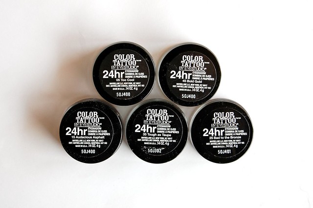
Pomegranate Punk is mislabelled as Audacious Asphalt for some reason


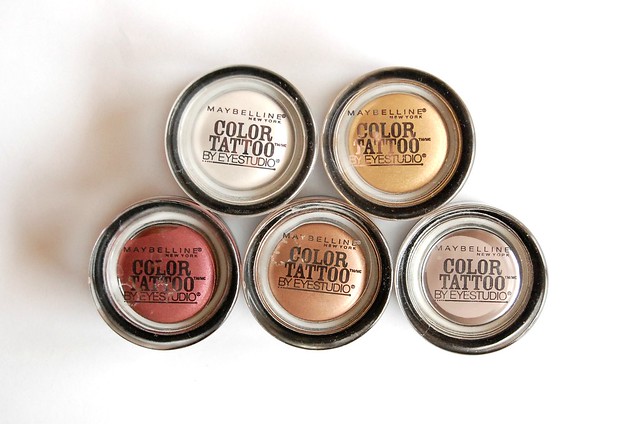
l-r: Too Cool, Tough as Taupe, Pomegranate Punk, Bold Gold, Bad to the Bronze
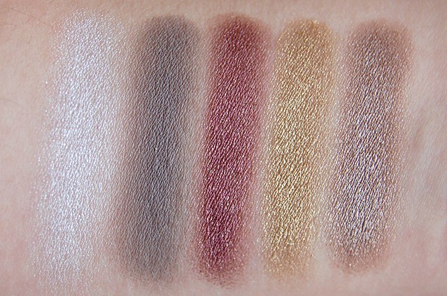
Tough as Taupe (35) I wanted to love this, but the colour is not flattering on me at all. It might work if it were more brown and lighter. It applies too much like a muddy slate grey which I find jarring against my yellow-toned skin. I also generally find that matte colours tend to appear flat and dull on me, which is why I prefer satin or shimmery eyeshadows. I'd probably use this as a base for smokey monochromatic makeup.
Pomegranate Punk (30) I wasn't sure whether this colour would work for me as it's red-toned, which just screams eye infection. I was pleasantly surprised with this one. Personally, it's too dark for daytime wear, but the colour works well for my skintone. It's more of a bronzy, plummy shade (with gold shimmer that isn't too noticeable when applied) that really adds depth to the eyes.
Bold Gold (45) This is a very yellow-toned, somewhat dirty gold that applies more on the sheer side. On its own, it doesn't quite work for my colouring, but it would be ideal to use as a base for gold eyeshadows. I'd imagine it'd be very much the same story as Too Cool though, meaning that Bold Gold would, subtly or significantly, change the colour of any eyeshadow (that wasn't exactly the same shade) placed over it.
Bad to the Bronze (25) My favourite, but I have one major gripe. This is very frosty, to the point that the silver shimmer sits on top of the shadow and threatens to overtake the colour altogether. The abundance of shimmer also looks a bit scaly on my lids. Having said that, this is clearly the most wearable shade and perfect for a daytime neutral eye. Slick it on with your finger, pop on a bit of eyeliner and mascara, and go.

l-r: Pomegranate Punk, Bad to the Bronze (with flick of eyeliner and mascara on top lashes)

l-r: Bad to the Bronze, Sidecar, Bold Gold, Half Baked, Smog, Pas des Copper
Some shades from the Urban Decay Naked palette to compare, as well as Essence Pas des Copper on the right end. Sidecar is very similar to Bad to the Bronze but a touch lighter (if anything, Sidecar looks practically identical to Pas des Copper, which I didn't anticipate). I thought Bold Gold might be similar to Half Baked and/or Smog, but the two aren't dupes at all. Half Baked is lighter, more golden, Bold Gold is a dirtier yellow, with even a slightly green tinge. I'd been using and raving on about Pas des Copper for a while now, but I'm not sure whether it's all that different to Bad to the Bronze to justify having both. The Maybelline is more taupe, frostier, a touch darker. The Essence is a bit more golden, slightly warmer. The main difference is staying power. The Color Tattoo eyeshadows have excellent wear time and are genuinely difficult to completely remove. Oddly, going a bit overboard with these cream eyeshadows has made me appreciate my existing powder eyeshadows. They're easier to work with and blend, not as messy, you don't need to worry about it setting, and I have a lot more colours to choose from. If you want to sample one shade from this range, I suggest Bad to the Bronze. If you want to play around with cream eyeshadows for a fraction of a MAC Paint Pot, these Color Tattoo ones are a good option.


0 Comments